The Big Picture: Insights Into How TEDxPortofSpain Selects Speakers
This is a repost. To view the original post follow this link.
For TEDxPortofSpain, the period 2014/2015 was exceptionally generative and we honed our speaker selection process. Volunteer Gizelle Carr and the team developed a methodology for speaker selection.
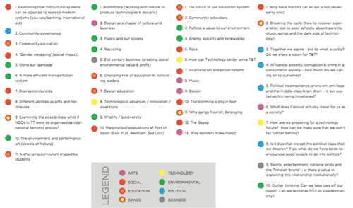
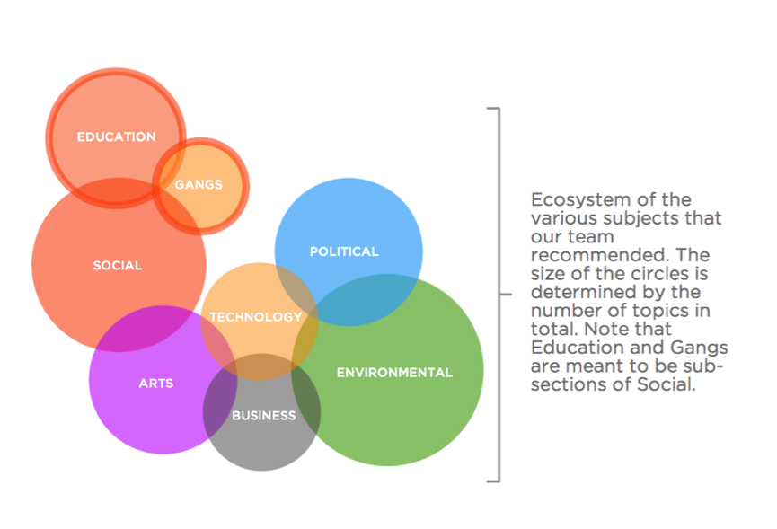
After meeting and sharing ideas and topics, they were then mapped into an infographic, to get a better understanding of the ecosystem of the topics. As it turned out, because so many of our most prominent issues as a society are social, a lot of the topics and speakers have been social. The areas of focus were then mapped for individual speakers, not so much as a guide but to provide a larger context for the information being shared, the bigger conversation.
While the analysis may not be new, the difference here is design, and the manner in which the facts are contextualized.
Some of the first Designers known for mapping information and data, such as David McCandless of Information is Beautiful, have commented on the fact that in the twenty first century, “we are all suffering from information overload”. Making information beautiful through design makes it more digestible, yes, but it also takes us from reading data to more meaningful interaction with it. He has likened the world we live in today as being a landscape of information, and the infographics he designs as being like roadmaps.
The data we mapped for TEDxPortofSpain speaker topics brought to the fore some of the most pressing issues in Trinidad and Tobago. The beauty of information being disseminated lies in the bare truth of it, and the ability of it to become a facilitator of new problem-solving ideas, action and development.
As David puts it, “In this connected age, you have to connect all the different numbers and sets of numbers; only then can you allow the data set to change your mindset.”
By Giselle Carr – TEDxPortofSpain Volunteer on the Speaker Team
Comments are closed.


