Doing. Undoing. Redoing. Explained.
By Giselle Carr and Ayrïd Chandler.
In exploring the theme for this year’s event on November 1st, Doing Undoing Redoing, we were inspired by the natural/organic, particularly swarm theory.
One bird or bee may be intelligent, but in the animal kingdom the colony is much more intelligent as a collective. Some examples include ant colonies, bird flocking, animal herding, bacterial growth and fish schooling. Swarm intelligence has provided insights into solving complex systems problems. Some popular examples are, transportation or traffic flow systems, emergency or disaster response, artificial intelligence (swarm robotics), epidemiology (spread of disease) and many more.
So what does this have to do with us?
This self-organizing principle helps species respond quickly to changes in their environment. It also reminds us of nature’s genius, and how simple actions of individuals add up to the complex behavior of a group. The collective abilities of the group are tapped when individuals act responsibly or make wise decisions.
In doing, undoing and redoing, nature forms, separates and reforms itself in order to adapt to changing environments, solve problems and meet challenges head on. How different would our world be if as a society, we understood that our individual actions are part of a larger, evolved whole?
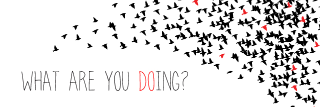
The theme comes to life visually with a flock of birds, and is reminiscent of our iconic scarlet ibis, but also reminds us of ideas in flight. How do these ideas that are shared at the annual TEDxPortofSpain event undo and redo our own ideas? How can we influence the flight trajectory of these ideas and positively impact others in our community?
Keeping with the natural theme established , we chose to get a bit more personal with the use of handwritten typography to accompany the flock. The act of doing, undoing or redoing is a personal one and we wanted to evoke a feeling of ownership and creation and felt handwriting achieved this more so than a computerised typeface such as Helvetica. Something as simple as the choice of a font was not taken lightly as typography, just like colours and images, can affect association and feeling. We are striving to be more relatable, accessible and approachable this year and the use of natural elements is meant to aid in that effect.
Comments are closed.

